Science has always fascinated me. Back in my school days, chemistry was more than just equations — it was the art of balance, precision, and reaction. Years later, that same sense of harmony guided my approach when designing for iPharm, a biotech company shaping the future of nutraceuticals.
My goal was simple yet challenging: to translate the rigor of science into a visual language — one that feels intelligent, trustworthy, and human.
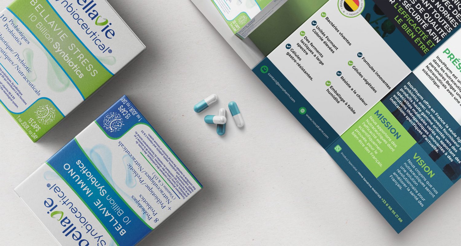
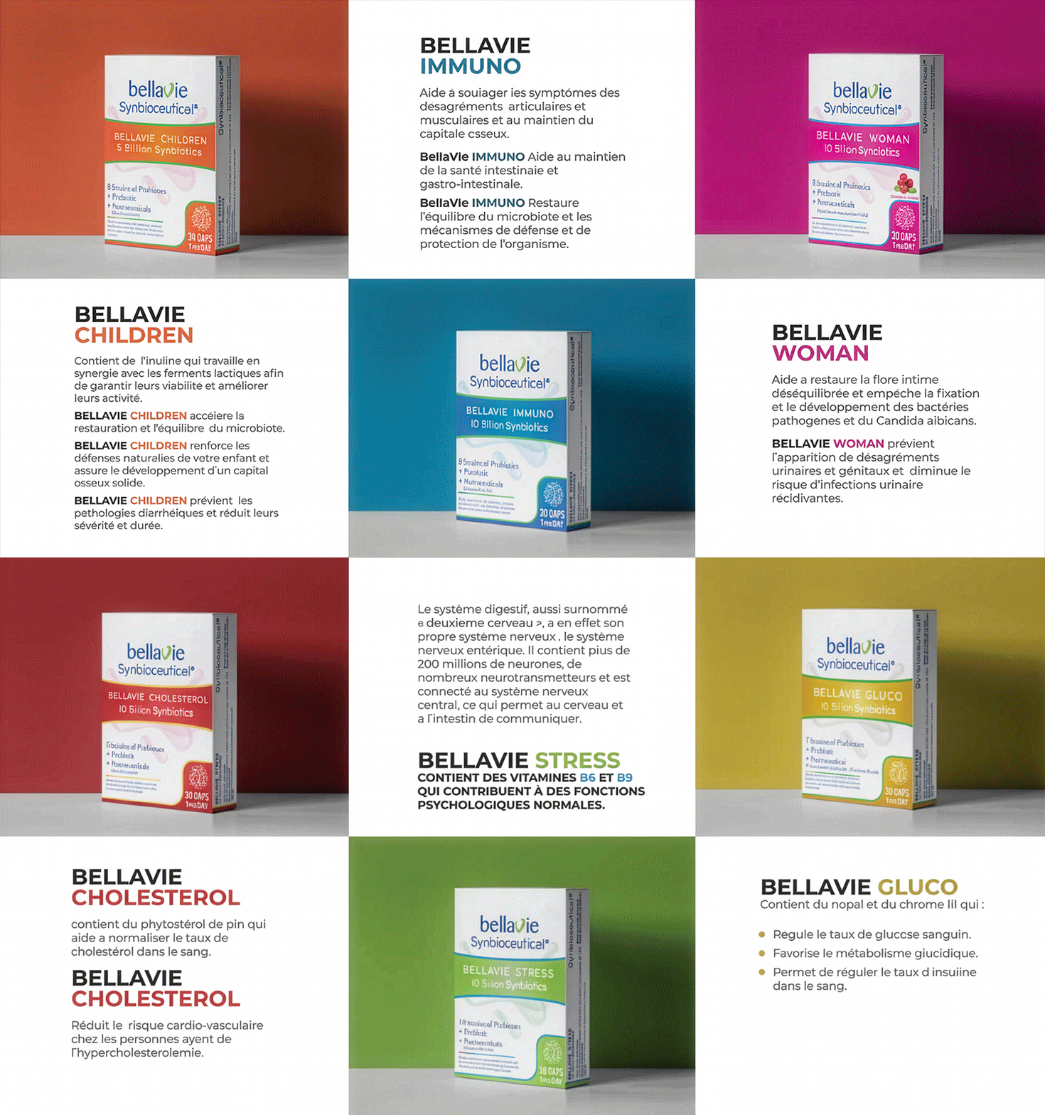
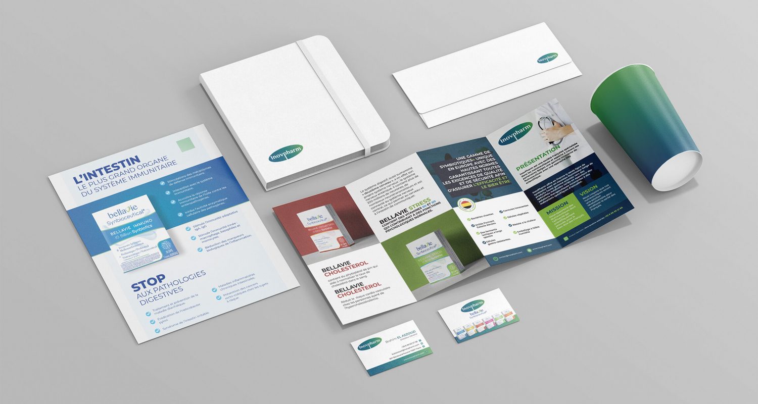
For iPharm’s BellaVie supplement line, I developed a complete visual system — from business cards and packaging design to flyers and an informational book explaining each product. Each design decision was rooted in scientific clarity — structure, balance, and flow — while keeping the emotional side of wellness alive through soft tones, clean layouts, and subtle details that speak to trust and health.
For iPharm’s BellaVie supplement line, I developed a complete visual system — from business cards and packaging design to flyers and an informational book explaining each product. Each design decision was rooted in scientific clarity — structure, balance, and flow — while keeping the emotional side of wellness alive through soft tones, clean layouts, and subtle details that speak to trust and health.


